Beeswarm plots are a way of plotting points that would ordinarily overlap so that they fall next to each other instead. In addition to reducing overplotting, it helps visualize the density of the data at each point (similar to a violin plot), while still showing each data point individually.
Installation
install.packages('ggbeeswarm')
Examples
geom_quasirandom()
$geom_quasirandom$: Uses a van der Corput sequence or Tukey texturing (Tukey and Tukey “Strips displaying empirical distributions: I. textured dot strips”) to space the dots to avoid overplotting.
set.seed(12345)
library(ggplot2)
library(ggbeeswarm)
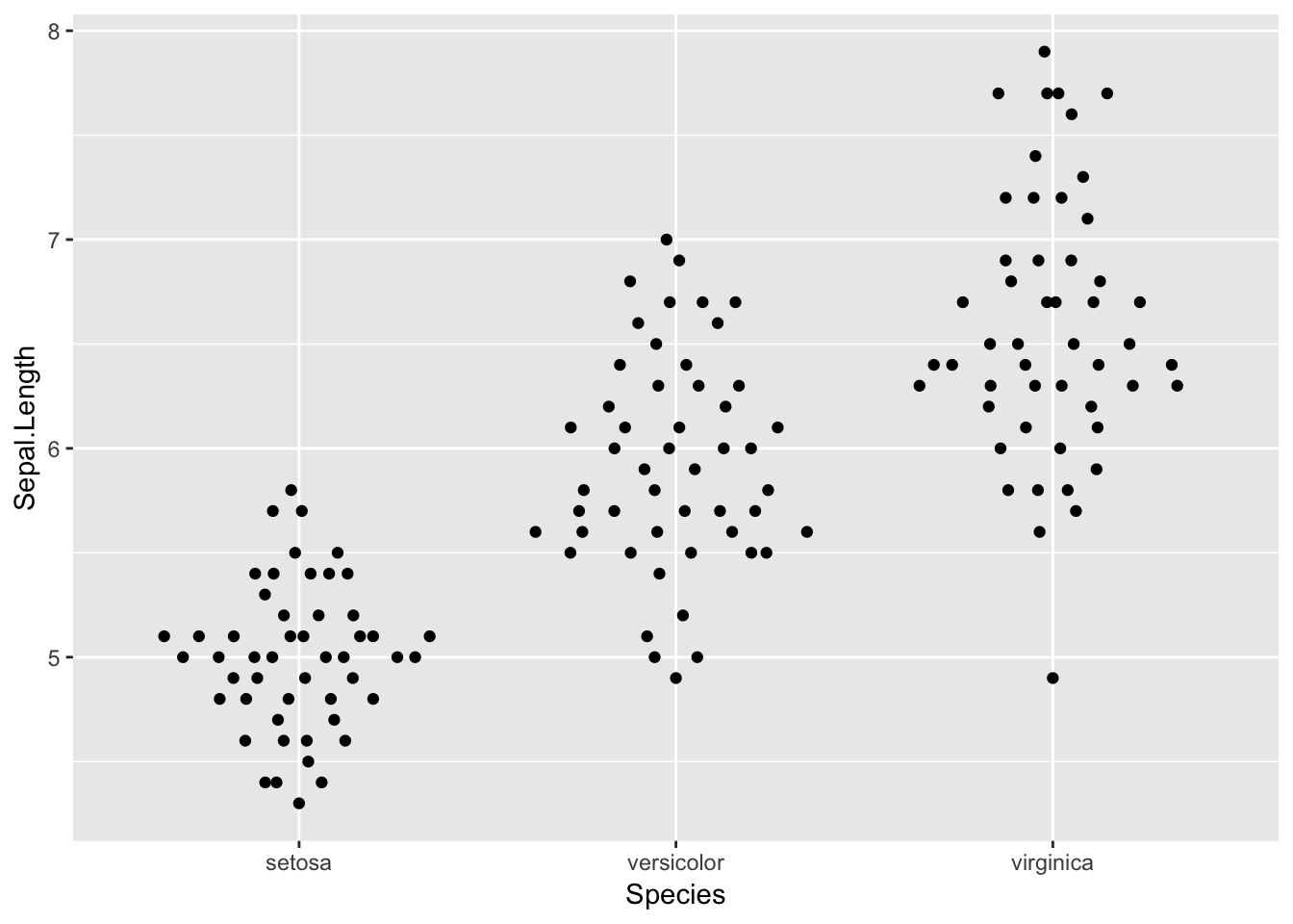
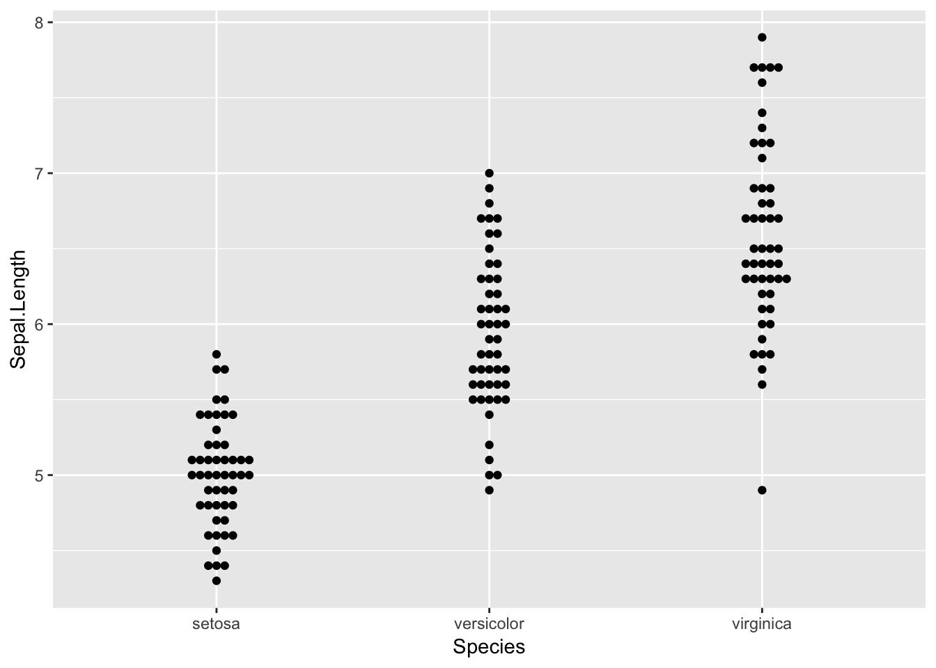
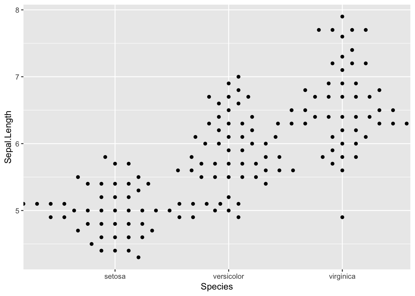
ggplot(iris, aes(Species, Sepal.Length)) +
geom_quasirandom()

Plotting with various width:
ggplot(iris, aes(Species, Sepal.Length)) +
        geom_quasirandom(varwidth = TRUE)
Plotting with fixed width:
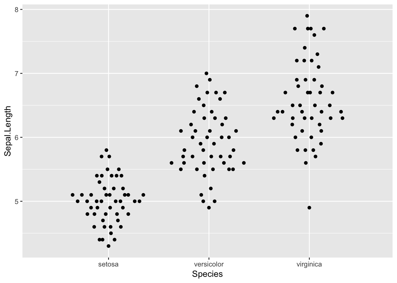
ggplot(iris, aes(Species, Sepal.Length)) +
        geom_quasirandom(dodge.width=1)
Alternative methods
$geom_quasirandom$ can also use several other methods to distribute points. For example:
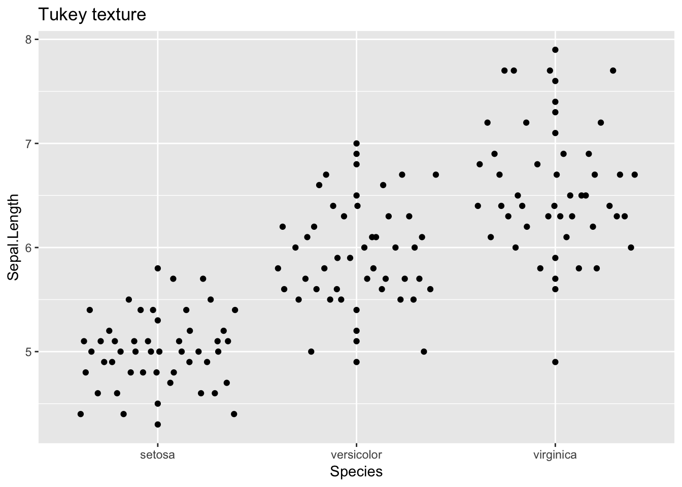
Tukey
ggplot(iris, aes(Species, Sepal.Length)) + geom_quasirandom(method = "tukey")+
        ggtitle("Tukey texture")
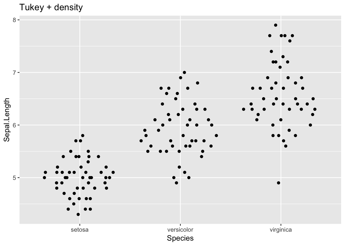
TukeyDense
ggplot(iris, aes(Species, Sepal.Length)) + geom_quasirandom(method = "tukeyDense") +
    ggtitle("Tukey + density")
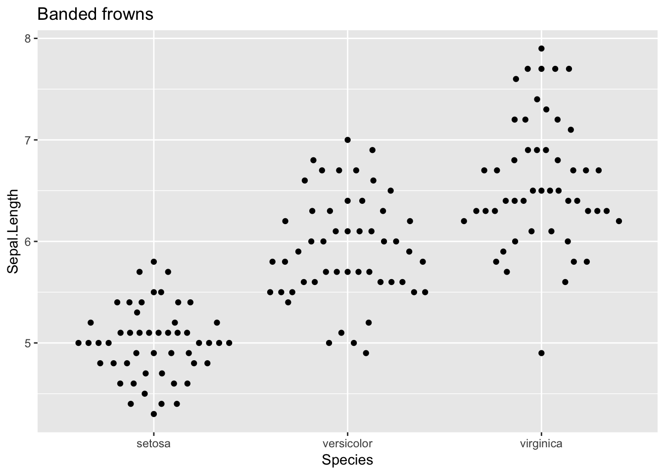
forwney
ggplot(iris, aes(Species, Sepal.Length)) + geom_quasirandom(method = "frowney") +
    ggtitle("Banded frowns")
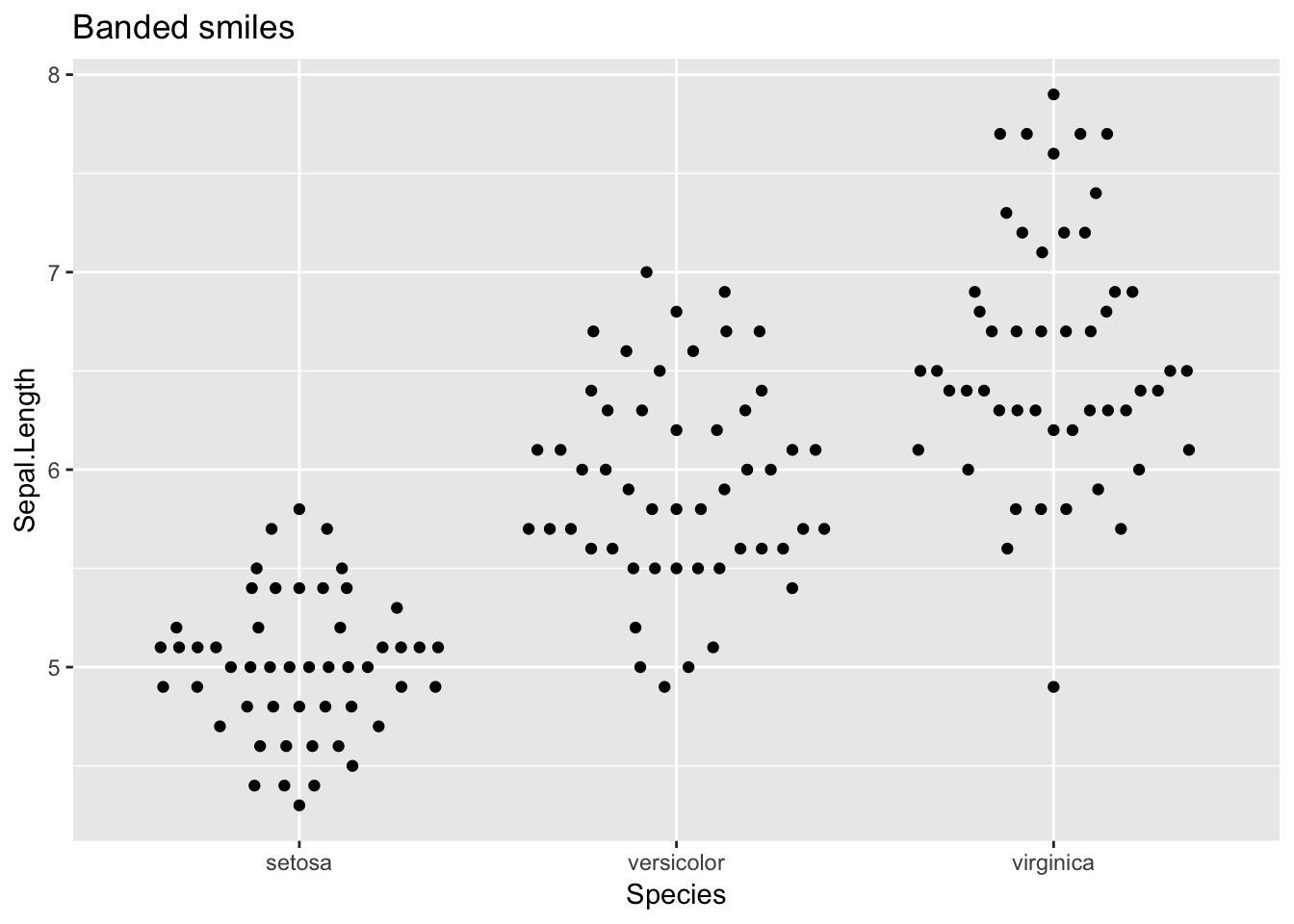
smiley
ggplot(iris, aes(Species, Sepal.Length)) + geom_quasirandom(method = "smiley") + ggtitle("Banded smiles")
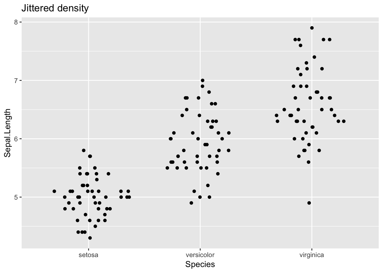
ggplot(iris, aes(Species, Sepal.Length)) +
        geom_quasirandom(method = "pseudorandom") +
        ggtitle("Jittered density")
geom_beeswarm
ggplot(iris,aes(Species, Sepal.Length)) +
        geom_beeswarm()
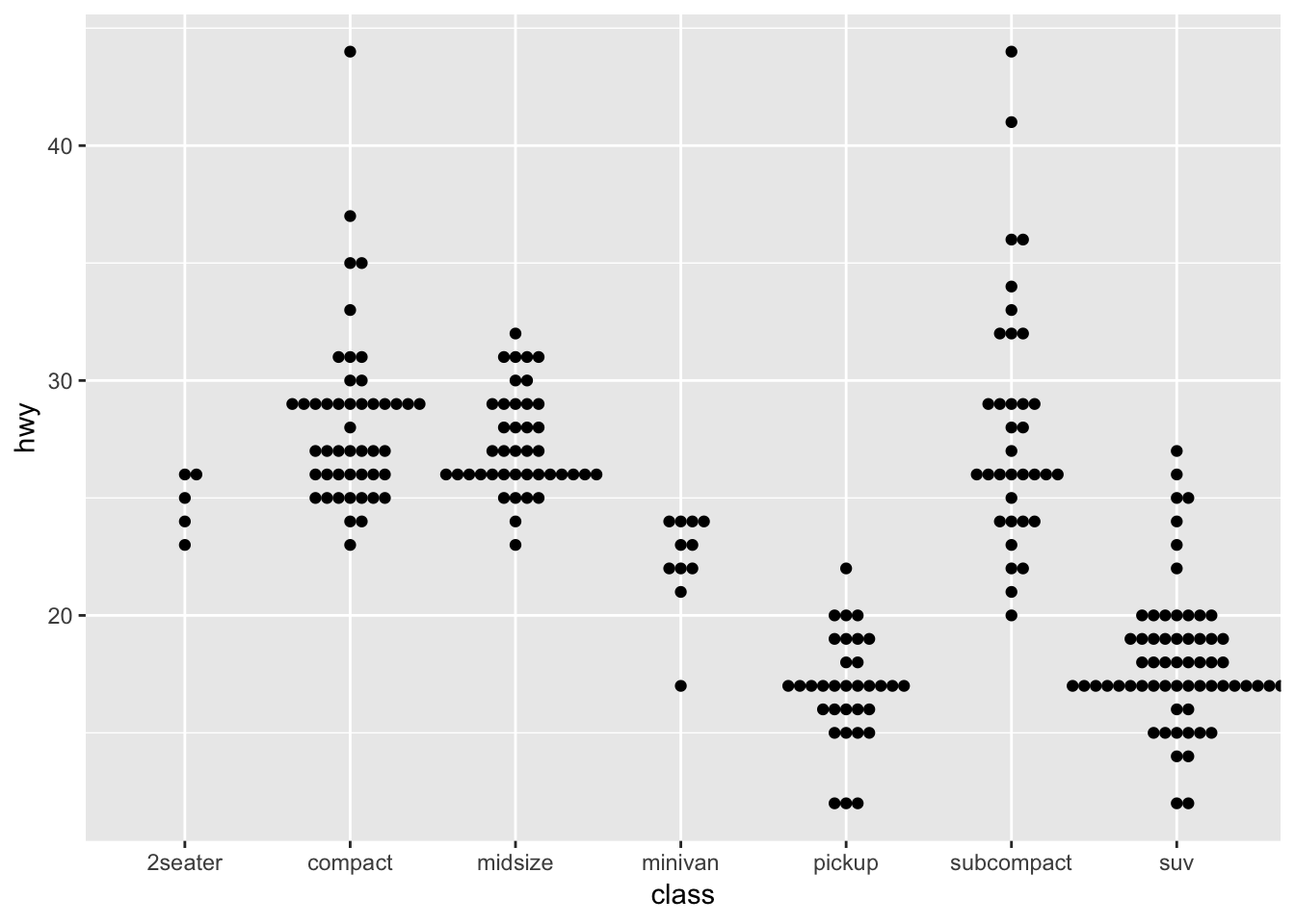
ggplot(mpg,aes(class, hwy)) +
        geom_beeswarm()
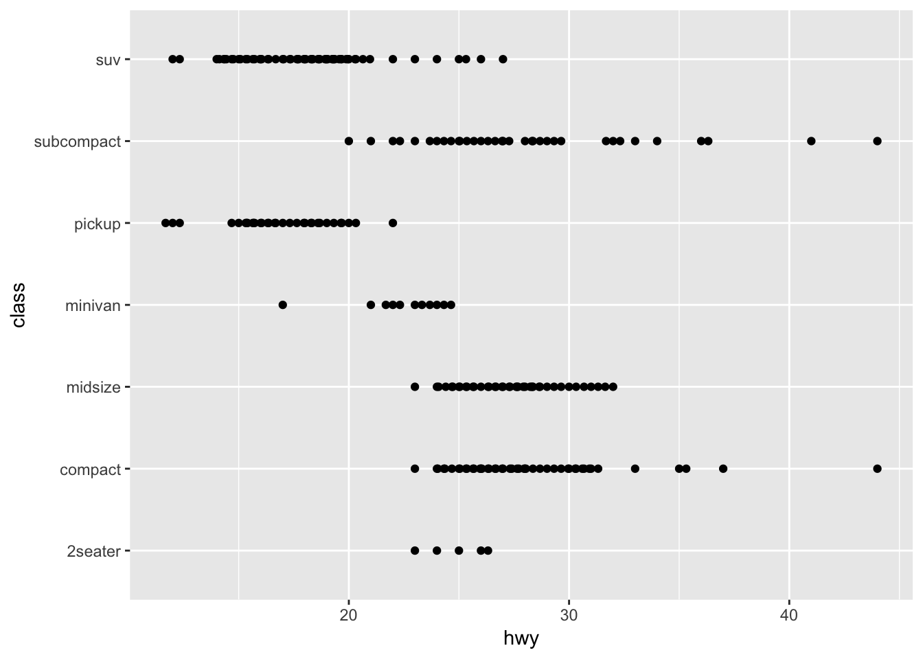
- With categorical y-axis
ggplot(mpg,aes(hwy, class)) +
        geom_beeswarm()
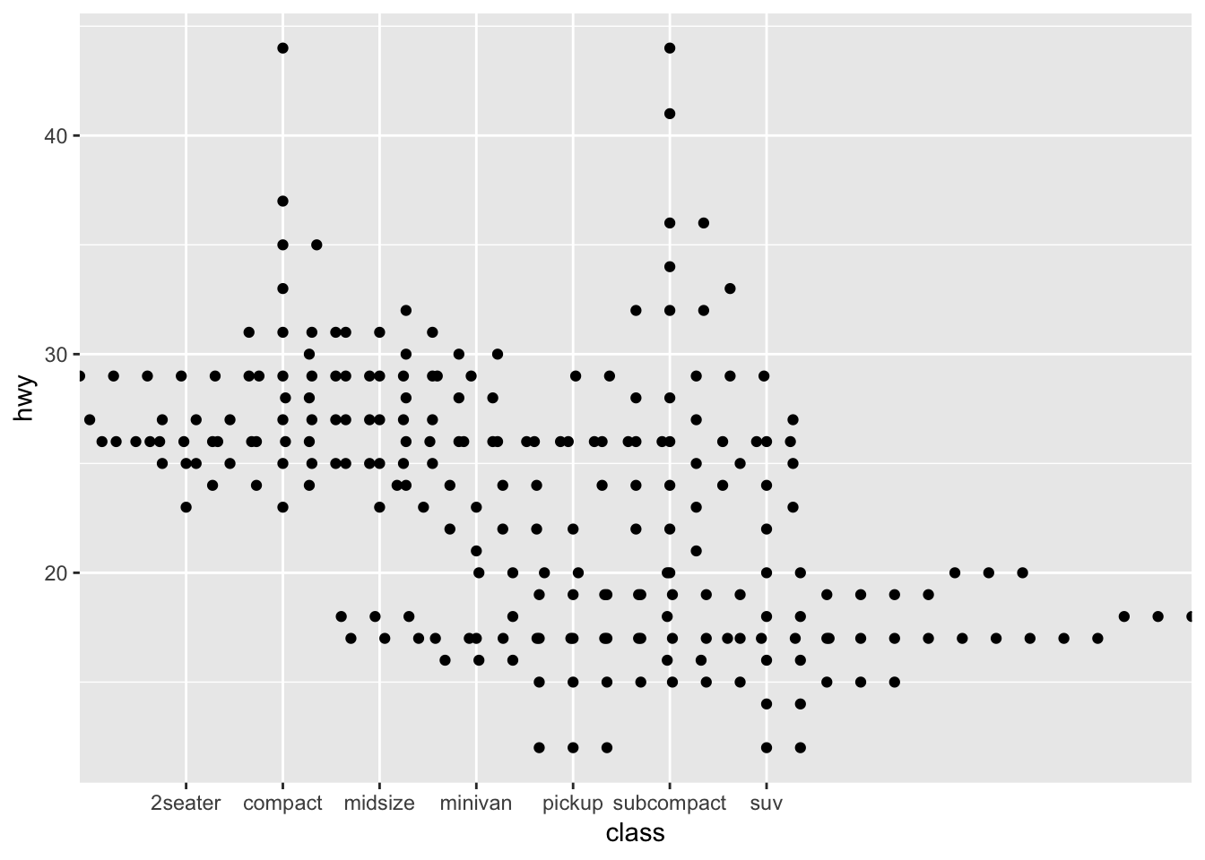
- ggplot doesn’t pass any information about the actual device size of the points to the underlying layout code, so it’s important to manually adjust the
cexparameter for best results
ggplot(mpg,aes(class, hwy)) +
        geom_beeswarm(cex=5)
ggplot(iris,aes(Species, Sepal.Length)) +
        geom_beeswarm(cex=4,priority='density')
With automatic dodging:
ggplot(iris, aes(Species, Sepal.Length)) +
        geom_beeswarm(dodge.width=0.7, cex=4)

Copy from: Erik Clarke and Scott Sherrill-Mix